SXSW EDU 2025: Do-It-Yourself (DIY) Accessibility Basics
As an educator, you put a lot of time, energy, and thought into creating materials for learners. For example, you make sure goals are clear and understandable. You prepare content that is aligned to standards. You also take pride in designing methods that are engaging and flexible.
Are you also considering accessibility for students with disabilities?
In the U.S., 15% of students from preschool through high school receive special education services because of a disability. Most of these students participate in general education classes. Additionally, there are some students with disabilities who don’t receive special education services, as well as some who have yet to be identified as having a disability. This is a significant population of students who often have trouble using educational materials that aren’t designed with accessibility in mind.
By practicing basic techniques available in most content development tools, you’ll ensure that students with sensory, physical, and cognitive disabilities can effectively use the materials you create. This resource offers examples of how to apply these techniques in two common document editors: Word and Google Docs.
Simple Techniques for Creating Accessible Documents
The next time you create a digital text document using Word or Google Docs, try at least one of the following five basic techniques. Add another technique to each new document you create. While there are more techniques to learn, mastering these five will greatly improve access to your content for students with disabilities.
- Proper Heading Structure
- Minimum Coor Contrast
- Descriptive Hyperlinks
- Alt Text
- Accessibility Checker
Proper Heading Structure
What Is Proper Heading Structure?
When you create a digital document for students, you probably choose a title and organize the content into sections. It’s also likely that you use different fonts, text sizes, or character options so that the title and section headings stand out from the body text. This is a logical way to help students understand the layout and organization of the information. The method you use to format the text determines whether your heading structure is proper.
Rather than using the formatting toolbar, the proper way to create headings is to use customizable Styles. The Styles panel provides a built-in method for creating a logical order of heading levels: Heading 1, Heading 2, Heading 3, etc. Using the Styles panel, you can assign specific fonts, text sizes, and character options to each heading level, as well as other text elements such as body text and lists.
Why Is Proper Heading Structure Important to Accessibility?
While sighted students benefit from the visual structure of heading levels, students who are blind or low vision need an alternative to understand the structural layout of a document. Many blind and low-vision students use software known as screen readers to access information in digital documents. Screen readers not only read aloud the text on the page but also announce important details about the document to the student. For example, if the document was created using Styles, the screen reader will inform the student of the Style of the text selected, as heard in the below video:
Students with physical disabilities who use switch technology or voice commands also benefit from the navigational feature of Styles. This enables the student to pre-read the document by quickly scanning topics and subtopics. The student can also navigate the document’s headings like an outline.
Do-It-Yourself: Practice Proper Heading Structure
Once you learn to create a proper heading structure in your document editor, you’ll wonder why you haven’t always been using Styles. Beyond accessibility, this method is far more efficient than manually formatting each heading of your document. Try it yourself by downloading one of the practice files:
What did you think of the process of adding Styles to text? How will you use your new understanding of Styles in your next digital document?
Minimum Color Contrast
What Is Minimum Color Contrast?
Color contrast is basically a measure of the brightness between two colors. In this case, the two colors are the text color and the background color of the digital document. The difference in brightness is called a ratio, which ranges from 1:1 (e.g., white on white) to 21:1 (e.g., black on white). A minimum contrast ratio of 4.5:1 is recommended for most cases.
Why Is Minimum Color Contrast Important?
When creating instructional content, you may choose to use a variety of colors or color combinations to convey information in different ways. When choosing color, it’s important to keep in mind that your perception of sufficient contrast may significantly differ from that of your students. Following a technical requirement of at least 4.5:1 will avoid color contrast barriers for students with varying levels of vision or color blindness.
Do-It Yourself: Practice Minimum Color Contrast
Use the WebAIM Contrast Checker to test varied combinations of foreground and background colors. Note that you can skip over the Hex Value fields and simply choose colors from the Color Pickers. Use the Lightness scale to quickly adjust the contrast ratio. Read the “Explanation” on the page for more details on how to use the tool and interpret the results of your tests.
While keeping the background color pure white (Hex Value #FFFFFF), try a variety of foreground colors, such as the following:
- Red tone: #E64747
- Green tone: #20B131
- Blue tone: #2882D7
Did anything surprise you about the results of the Contrast Checker? How will you use new understanding about minimum color contrast when creating your next digital document?
Descriptive Hyperlinks
What Are Descriptive Hyperlinks?
Hyperlinks add important functionality to digital documents. For example, they provide interactivity and expand students’ access to information about a topic. One way to insert a hyperlink in a digital document is to simply copy and paste the webpage address (or Universal Resource Locator (URL)) you want students to follow. This results in what is called a “naked URL.” However, best practice is to replace naked URLs with descriptive text that provides information about the link’s destination. This is called a descriptive hyperlink.
For example, suppose you’re creating a digital document with a link to the homepage of National Geographic. Here are three versions of how you might present the hyperlink, followed by an explanation of each:
Version 1: Visit the homepage of National Geographic at https://www.nationalgeographic.com/.
Version 1 is an example of a naked URL. While the destination is embedded in the hyperlink (NationalGeographic.com), there’s additional unnecessary hypertext around it.
Version 2: Visit the homepage of National Geographic.
Version 2 is a good example of a descriptive hyperlink.
Version 3: Click here to visit the homepage of National Geographic.
Version 3 is a bad example of a descriptive hyperlink. The phrase “click here” does not describe the destination of the hyperlink.
Why Are Descriptive Hyperlinks Important?
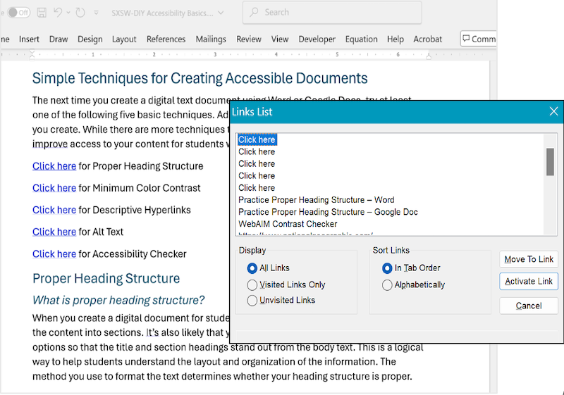
The text of a URL may indicate its destination, particularly for a website’s homepage (e.g., https://www.nationalgeographic.com/). Many URLs, however, are long and without information about their destination (e.g., links to shared files on a secure school server). Regardless, adding descriptive titles makes your hyperlinks more accessible to students who use screen readers. A screen reader speaks aloud the descriptive text of a hyperlink, like how it reads aloud heading levels in Styles. If the descriptive text is “click here,” the screen reader user won’t know the destination of the link. And because blind students commonly skim documents by navigating link to link with a screen reader, a document with multiple instances of “click here” hyperlinks would provide no distinction from one link to the next.
The screenshot below shows a digital document with the phrase “click here” used in place of descriptive text for the hyperlinks to each of the five techniques presented on this web page. In front of the digital document is a “Links List” window of a screen reader, showing that only “click here” is recognized, and therefore the only information provided to the user.
Do-It-Yourself: Practice Descriptive Hyperlinks
Try creating a descriptive hyperlink by downloading one of the practice files:
What did you think of the process for adding descriptive text to hyperlinks? How will you use this new skill when you create your next digital document?
Alt Text
What Is Alt Text?
Alt text (short for alternative text) is a textual substitute for visual information conveyed by the images in your document. Alt text represents both the content and the function of an image. For example, let’s say you choose to add an image of the Canadian flag to your document. The content alone, “maple leaf,” wouldn’t be sufficient alt text. Rather, the alt text would include the context of the maple leaf as a symbol on the flag. Notice the distinction in alt text between the following two images:


The image on the left, of a maple leaf in nature, might be used in a digital resource about different types of trees. The image on the right, of the Canadian flag, might appear in a digital resource about flags of the world.
Why Is Alt Text Important to Accessibility?
Alt text provides an alternative equivalent of the visual information conveyed by images. A screen reader announces alt text, giving blind and low-vision students timely access to the content. Additionally, when low bandwidth is an issue in school or at home, alt text appears in place of images that won’t load.
Do-It-Yourself: Practice Alt Text
Choosing the right alt text for an image is more complex than what is presented in this brief description. Before practicing the technique of how to add alt text to an image in a document, refer to WebAIM’s examples and best practices for alt text.
What surprised you about the process of choosing alt text for an image? For example, if you’re a Word user, did you think the auto-generated version of alt text would be more useful? What will you keep in mind the next time you create a digital document with images?
Accessibility Checker

An accessibility checker scans your document for a range of accessibility issues. Checkers flag errors to help you find what to fix. Suggestions for understanding errors and how to fix them are also common. It’s important to note that an accessibility checker won’t catch every accessibility issue. Though a manual check should always be conducted, automatic checkers are an essential tool for optimizing efforts to ensure accessibility.
Do-It-Yourself: Practice With an Accessibility Checker – Word
The following two Word documents have the same textual and image content. One was created to pass Word’s Accessibility Checker and the other has accessibility errors. The content was sourced from a Public Domain material provided by the National Park Service to OER Commons .
Start by downloading and opening both documents. In each document, follow the accessibility checklist.
- Traveling the National Road (.docx) – accessibility issues found
- Traveling the National Road (.docx) – no accessibility issues found
Do-It-Yourself: Practice With an Accessibility Checker – Google Docs
At present, Google Docs does not have a built-in accessibility checker. GrackleDocs is a third-party add-on for consideration.
Remember, the use of an accessibility checker alone isn’t sufficient for ensuring your document is usable by students with disabilities. Just like spelling and grammar checkers, a foundational understanding of proper techniques is needed in the development of your document. The checker should always be used in combination with a manual review for errors.
